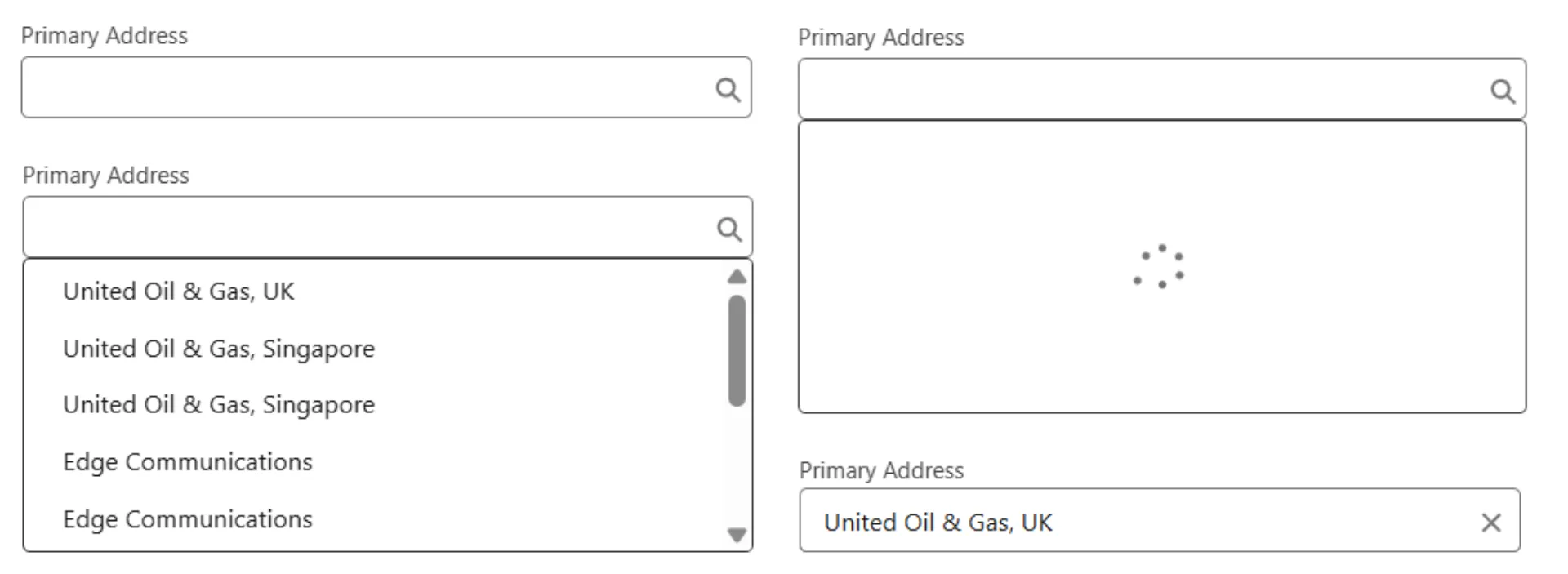
In the previous post, we walked through the structure and logic of building a custom lookup field in Salesforce LWC. We covered how to fetch records, debounce the server call based on user input, manage selected record value, and control dropdown visibility using event bubbling. Now, it’s time to dive deeper into advanced filter criteria and accessibility enhancements. These tweaks will make our component production-ready.
You can follow along with the full code from the Salesforce Custom Components.
Advanced Filter Criteria
We were already sending the filterValues, Now, we’ve added the logic to actually use these values. Let’s take a closer look at how this works.
Using Filter Values
The following Apex code demonstrates how we use the comma separated filter values in the query.
@AuraEnabled
public static List<LookupRecordWrapper> fetchLookupRecords(
  String lookupName,
  String searchString,
  String filterValues
) {
  //... no change
  if(String.isNotBlank(customLookupProperty.SC_Condition__c)) {
    String condition = customLookupProperty.SC_Condition__c;
    if(String.isNotBlank(filterValues)) {
      List<String> filterValueList = new List<String>();
      for(String filterValue: filterValues.split(',')) {
        filterValueList.add(filterValue.trim());
      }
      condition = String.format(customLookupProperty.SC_Condition__c, filterValueList);
    }
    query += 'AND (' + condition + ') ';
  }
  //... no change
}
To make everything work smoothly, we need to ensure that the SC_Condition__c field in the metadata is properly set up.
In our next post, we’ll walk through how to write these conditions in the metadata to ensure they work as expected.
Enhance Accessibility
Building accessible components ensures that everyone, including users with disabilities, can interact with your application.
Aria Attributes
Let’s ensure that the input and the dropdown elements are also accessible by adding additional aria attributes:
<input
  type="text"
  class="slds-input search-input"
  aria-expanded={showDropdown}
  aria-controls="lookup-dropdown"
  aria-haspopup="listbox"
  placeholder={placeholder}
  onkeyup={handleInputKeyUp}
/>Explanation:
aria-expanded: Indicates whether the dropdown is open or closed.aria-controls: Links the input with the dropdown list.aria-haspopup: Indicates that the input will trigger a listbox.
Keyboard Navigation
To improve the user experience and accessibility of our component, we’ll add support for keyboard navigation.
Helper Methods
We’ll create a few helper methods to manage the keyboard navigation. These will handle the logic for moving between items in the list, updating the focus and selecting a record from the list.
- To navigate to the next and previous items, we use the modulo operator to cycle through the list.
- The
updateFocus()method will add afocused-itemclass to the item currently in focus based on the focusedIndex, and remove the class from others. - The
selectFocusedItem()method helps in selecting the currently focused item when the user presses “Enter”.
focusedIndex = -1;
focusNextItem() {
  if (this.lookupResults.length > 0) {
    this.focusedIndex = (this.focusedIndex + 1) % this.lookupResults.length;
    this.updateFocus();
  }
}

focusPreviousItem() {
  if (this.lookupResults.length > 0) {
    this.focusedIndex =
      this.focusedIndex === 0 ? this.lookupResults.length - 1 : this.focusedIndex - 1;
    this.updateFocus();
  }
}

updateFocus() {
  this.template.querySelectorAll('.dropdown-container__list-item').forEach((item, index) => {
    if (index === this.focusedIndex) {
      item.classList.add('focused-item');
      item.scrollIntoView({ block: 'nearest', behavior: 'smooth' });
    } else {
      item.classList.remove('focused-item');
    }
  });
}

selectFocusedItem() {
  if (this.focusedIndex !== -1 && this.lookupResults.length > 0) {
    const {value, label} = this.lookupResults[this.focusedIndex];
    this.selectLookupRecord(label, value);
  }
}
Event Handlers
The dropdown with the lookup records currently appears when the user clicks on the input field. However, many users navigate using the “Tab” key, so we need to handle the onfocus event to show the dropdown when the input field gains focus.
<input
  ...
  onfocus={handleInputFocus}
/>handleInputFocus() {
if(!this.showDropdown) {
this.fetchLookupRecordsImperative();
}
this.showDropdown = true;
}We also already have a keyup event listener on the input field. Let’s update it to handle the arrow keys, “Enter”, and “Esc” to enable seamless navigation through the lookup records.
handleInputKeyUp(event) {
  switch (event.keyCode) {
    case 40: // Arrow down
      this.focusNextItem();
      break;
    case 38: // Arrow up
      this.focusPreviousItem();
	  break;
    case 13: // Enter key
      this.selectFocusedItem();
      break;
    case 27: // Esc key
      this.showDropdown = false;
      break;
    default:
      if(this.search !== event.target.value) {
        this.search = event.target.value;
        this.fetchLookupRecordsImperative();
      }
  }
}
To visually highlight the focused item in the dropdown, we can use the following CSS:
.focused-item {
  background-color: #f0f8ff;
  outline: none;
}
This will give the user a clear visual cue about which item is currently in focus as they navigate with the keyboard.
Conclusion
In this post, we have added more features to the Lookup Field component, including:
- Providing filter criteria with filter values
- Accessibility improvements through ARIA attributes and keyboard navigation.
In the next post, we will see how to use this component.
You can implement these features in your own project or try out the full solution from the Salesforce Custom Components.
